SAIYAN ARMOUR TYPEFACE
SAIYAN ARMOUR TYPEFACE
A custom display typeface inspired by Saiyan armour from Dragon Ball, combining typography and mechanical design into a bold, expressive lettering system.
Year
2025
Category
Illustration

Objective
Objective
The objective of this project was to create an original display typeface inspired by anime and mechanical armour design while exploring typography as a form of visual expression and identity. The goal was to design a bold and recognizable typeface that functions not only as readable letterforms, but also as a stylized visual system connected to pop culture and futuristic aesthetics.
The objective of this project was to create an original display typeface inspired by anime and mechanical armour design while exploring typography as a form of visual expression and identity. The goal was to design a bold and recognizable typeface that functions not only as readable letterforms, but also as a stylized visual system connected to pop culture and futuristic aesthetics.
Objective
The objective of this project was to create an original display typeface inspired by anime and mechanical armour design while exploring typography as a form of visual expression and identity. The goal was to design a bold and recognizable typeface that functions not only as readable letterforms, but also as a stylized visual system connected to pop culture and futuristic aesthetics.
Process
Process
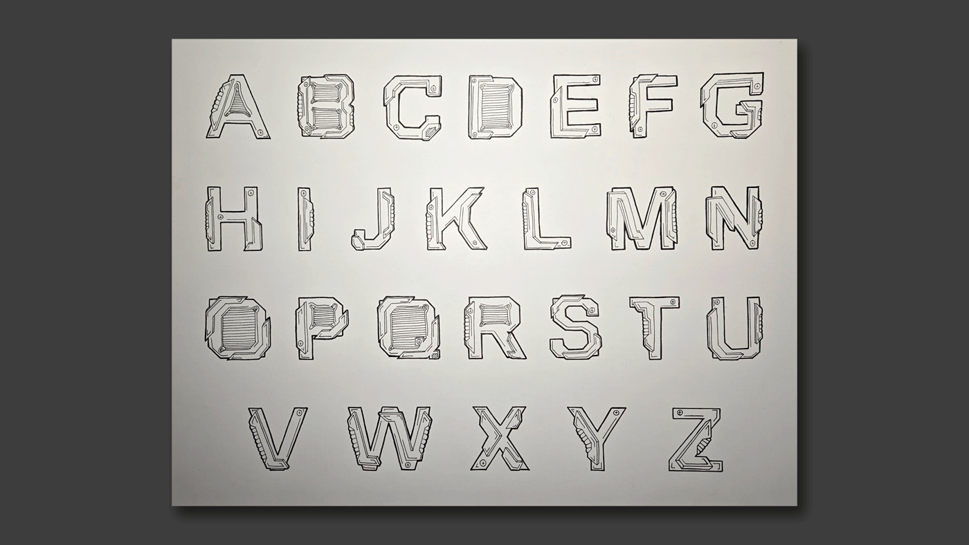
The typeface design was inspired by the Saiyan armour from the Dragon Ball anime series, particularly Vegeta’s armour design. I explored mechanical and futuristic forms by adding layered armour plates, bolts, grooves, and angular structures into each letterform to create a cybernetic and robotic appearance. The challenge of the project was maintaining readability while still adding enough detail to make the typeface visually unique and expressive.
I first sketched the letterforms by hand to experiment with structure, consistency, and proportion before refining them digitally. Blue, white, and gold colors were chosen to resemble the recognizable Saiyan armour palette and strengthen the connection to the anime inspiration. Because this is a display typeface, the letters were designed to work best at larger sizes for posters, titles, and branding applications where the details can be fully appreciated. This project allowed me to combine typography, illustration, and pop culture influences while showcasing creativity in developing a complete custom typeface system.
The typeface design was inspired by the Saiyan armour from the Dragon Ball anime series, particularly Vegeta’s armour design. I explored mechanical and futuristic forms by adding layered armour plates, bolts, grooves, and angular structures into each letterform to create a cybernetic and robotic appearance. The challenge of the project was maintaining readability while still adding enough detail to make the typeface visually unique and expressive.
I first sketched the letterforms by hand to experiment with structure, consistency, and proportion before refining them digitally. Blue, white, and gold colors were chosen to resemble the recognizable Saiyan armour palette and strengthen the connection to the anime inspiration. Because this is a display typeface, the letters were designed to work best at larger sizes for posters, titles, and branding applications where the details can be fully appreciated. This project allowed me to combine typography, illustration, and pop culture influences while showcasing creativity in developing a complete custom typeface system.
Process
The typeface design was inspired by the Saiyan armour from the Dragon Ball anime series, particularly Vegeta’s armour design. I explored mechanical and futuristic forms by adding layered armour plates, bolts, grooves, and angular structures into each letterform to create a cybernetic and robotic appearance. The challenge of the project was maintaining readability while still adding enough detail to make the typeface visually unique and expressive.
I first sketched the letterforms by hand to experiment with structure, consistency, and proportion before refining them digitally. Blue, white, and gold colors were chosen to resemble the recognizable Saiyan armour palette and strengthen the connection to the anime inspiration. Because this is a display typeface, the letters were designed to work best at larger sizes for posters, titles, and branding applications where the details can be fully appreciated. This project allowed me to combine typography, illustration, and pop culture influences while showcasing creativity in developing a complete custom typeface system.


More Works More Works
More Works More Works

