Katana Kafe
Katana Kafe
A modern airport café identity inspired by movement and aviation, featuring a logo that resembles a pilot’s wing pin and reflects the experience of dining beside a runway.
Year
2026
Category
Branding

Objective
Objective
The objective of the Katana Kafé & Grill brand identity project was to create a modern and memorable restaurant identity that reflects energy, professionalism, and the unique atmosphere of an airport café with a runway view.
The objective of the Katana Kafé & Grill brand identity project was to create a modern and memorable restaurant identity that reflects energy, professionalism, and the unique atmosphere of an airport café with a runway view.
Objective
The objective of the Katana Kafé & Grill brand identity project was to create a modern and memorable restaurant identity that reflects energy, professionalism, and the unique atmosphere of an airport café with a runway view.
Process
Process
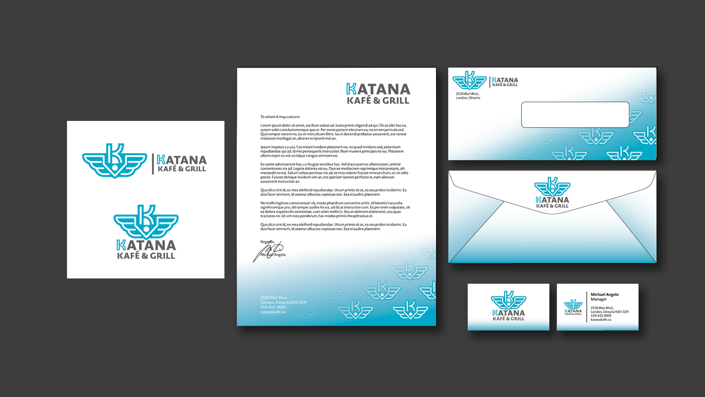
The design was inspired by movement, travel, and aviation. I used the letter “K” as the main symbol and combined it with wing-like geometric shapes to represent motion, flight, and the airport environment. The logo was also designed to resemble the aviation-style emblems or pins worn by pilots, helping create a stronger connection to the airport setting and runway experience. The symmetrical structure creates a clean and balanced appearance, while the pointed center element adds strength and direction, making the logo visually memorable. Bright cyan blue was chosen to create a fresh and energetic feel that connects with travelers and modern customers. The branding was then applied consistently across stationery materials to create a professional and cohesive identity that matches the café’s modern airport setting.
The design was inspired by movement, travel, and aviation. I used the letter “K” as the main symbol and combined it with wing-like geometric shapes to represent motion, flight, and the airport environment. The logo was also designed to resemble the aviation-style emblems or pins worn by pilots, helping create a stronger connection to the airport setting and runway experience. The symmetrical structure creates a clean and balanced appearance, while the pointed center element adds strength and direction, making the logo visually memorable. Bright cyan blue was chosen to create a fresh and energetic feel that connects with travelers and modern customers. The branding was then applied consistently across stationery materials to create a professional and cohesive identity that matches the café’s modern airport setting.
Process
The design was inspired by movement, travel, and aviation. I used the letter “K” as the main symbol and combined it with wing-like geometric shapes to represent motion, flight, and the airport environment. The logo was also designed to resemble the aviation-style emblems or pins worn by pilots, helping create a stronger connection to the airport setting and runway experience. The symmetrical structure creates a clean and balanced appearance, while the pointed center element adds strength and direction, making the logo visually memorable. Bright cyan blue was chosen to create a fresh and energetic feel that connects with travelers and modern customers. The branding was then applied consistently across stationery materials to create a professional and cohesive identity that matches the café’s modern airport setting.


More Works More Works
More Works More Works

